Re-designing payment
gateway platform
Intro
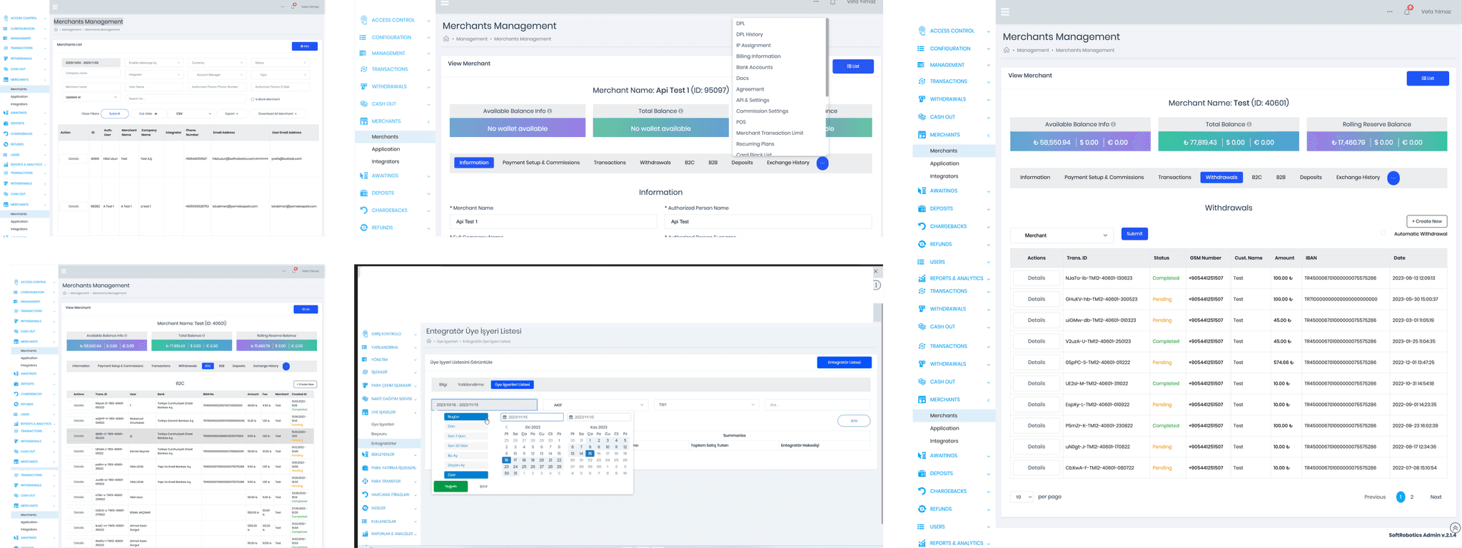
Redesigning a platform with over 450 screens was a significant challenge. Breaking down major tasks into smaller, manageable sub-tasks and creating detailed to-do lists was essential for clear communication with internal stakeholders and maintaining an organized workflow.
Users were unhappy with the experience
PMs got called directly by customers to ask about where a specific feature was, or certain things could be done.
Non-scalable platform
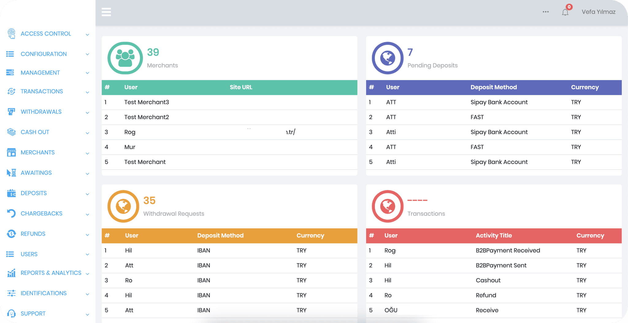
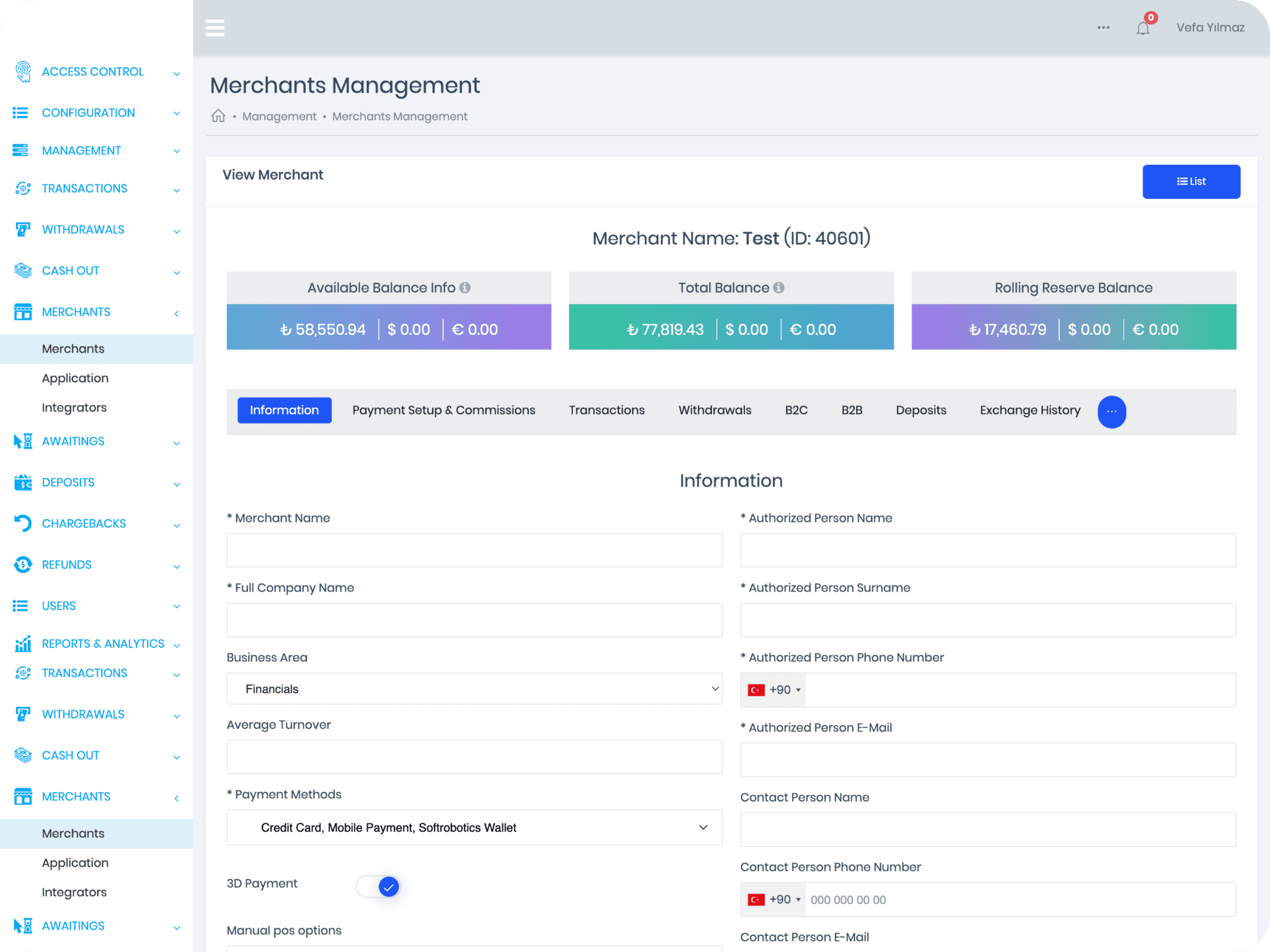
the existing platform wasn't scalable. Additional features were all added into a top navigation bar where a "more" icon would reveal all sub-menu items.
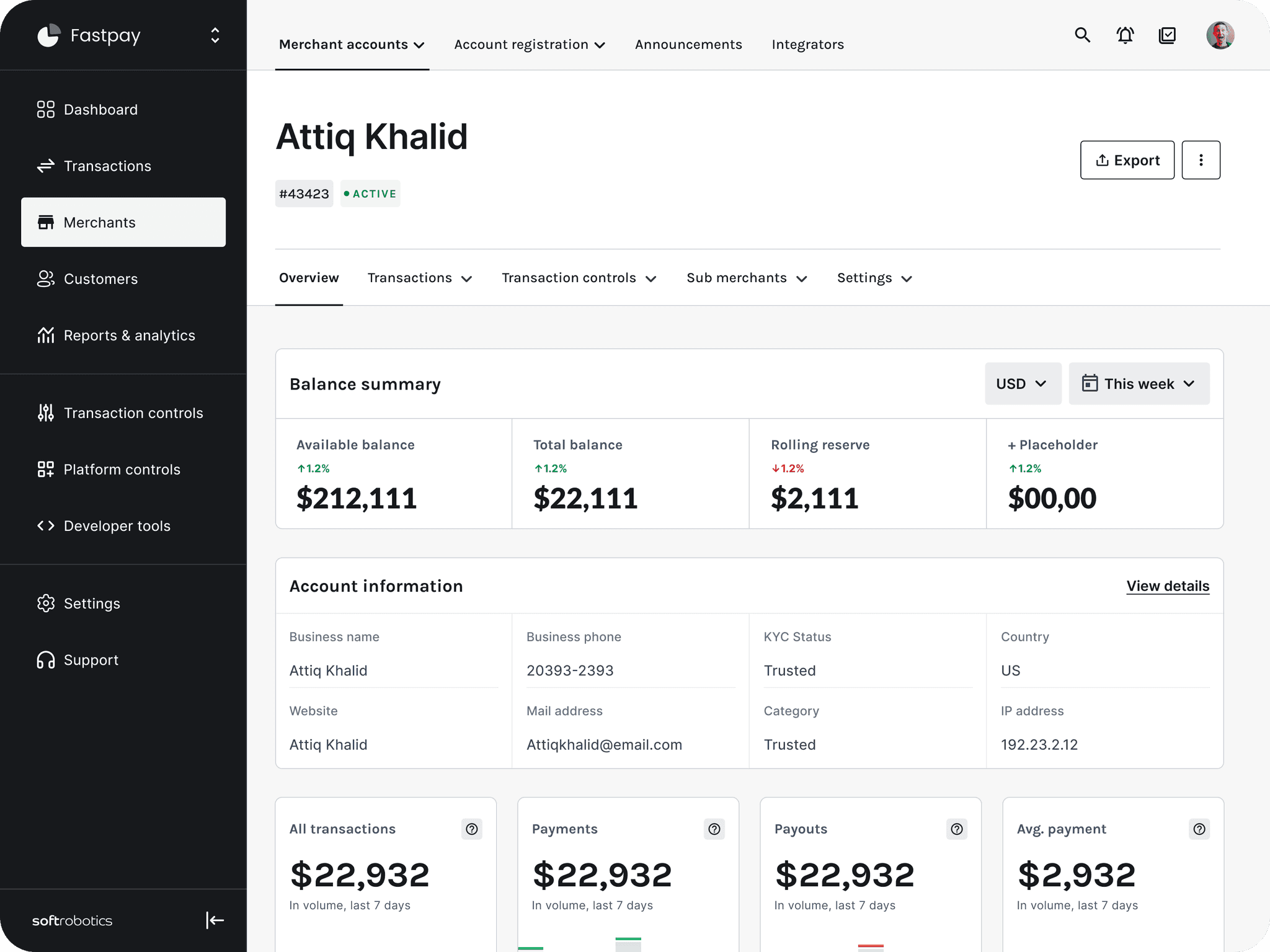
The platform needed new foundations for IA, UX, UI, and design library that is scalable, flexible, simple, clear, and most of all, understandable.
The plan
Need
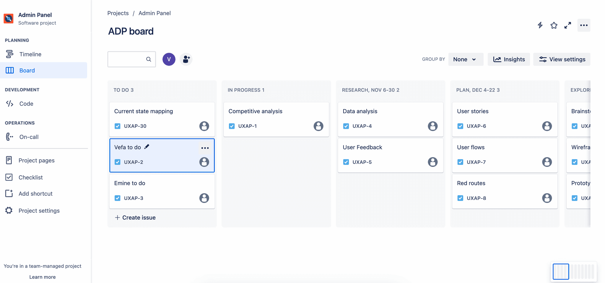
Capture all major and minor UX tasks to document progress.
Action
Created a roadmap for every week and added detailed tasks to track the progress + define all steps needed.
Result
Transparent communication with the internal stakeholders
A solid foundation for long-term UX and UI task management within the team.
Stakeholder interviews
Need
Getting more information about everything. (needs, short term and long term plans, team dynamics, customer feedback)
Action
16+ hours of calls with the internal team (PM, PO, Dev). Identified user types, account types, and actions taken by each.
Result
A comprehensive documentation of existing flows, with additional notes, flowcharts, and details. This became the foundation for the entire project moving forward.
Understanding user profiles / personas
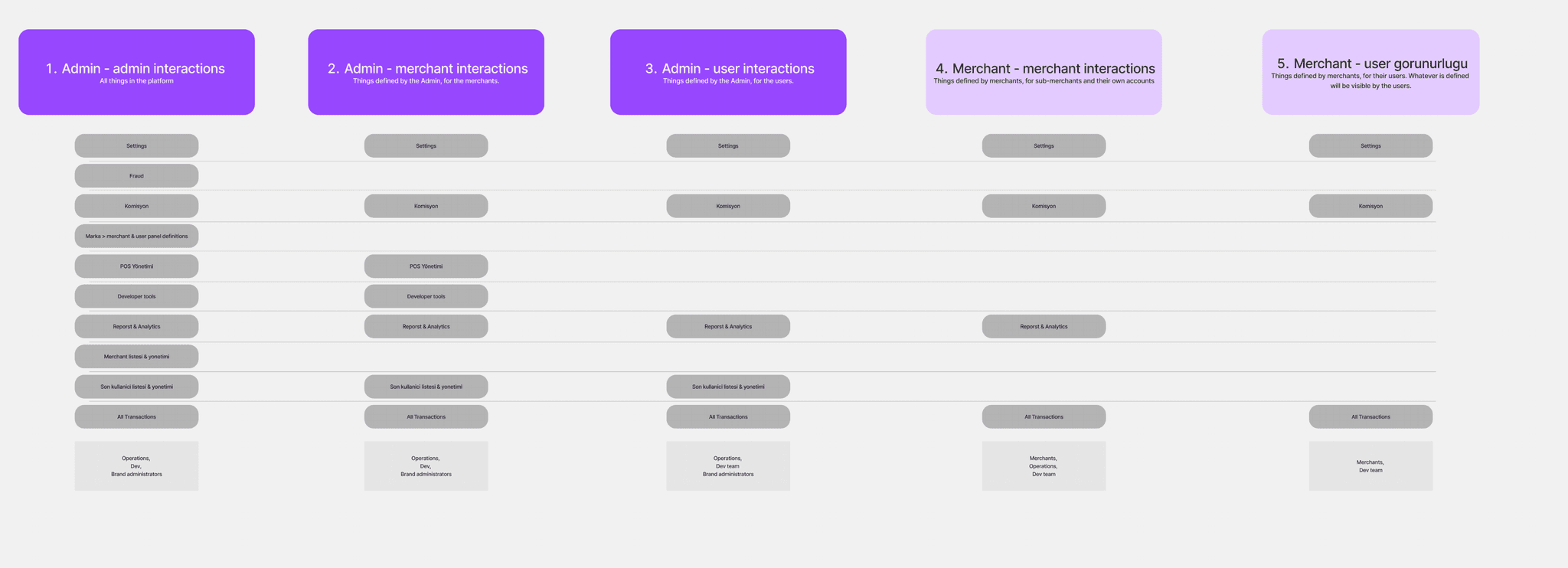
Need
Listing actions and requirements for each user profile / persona.
Action
Aligning with the PMs, understanding the scope of actions
Result
Inventory of actions in order of user profile hierarchy
Competitor analysis
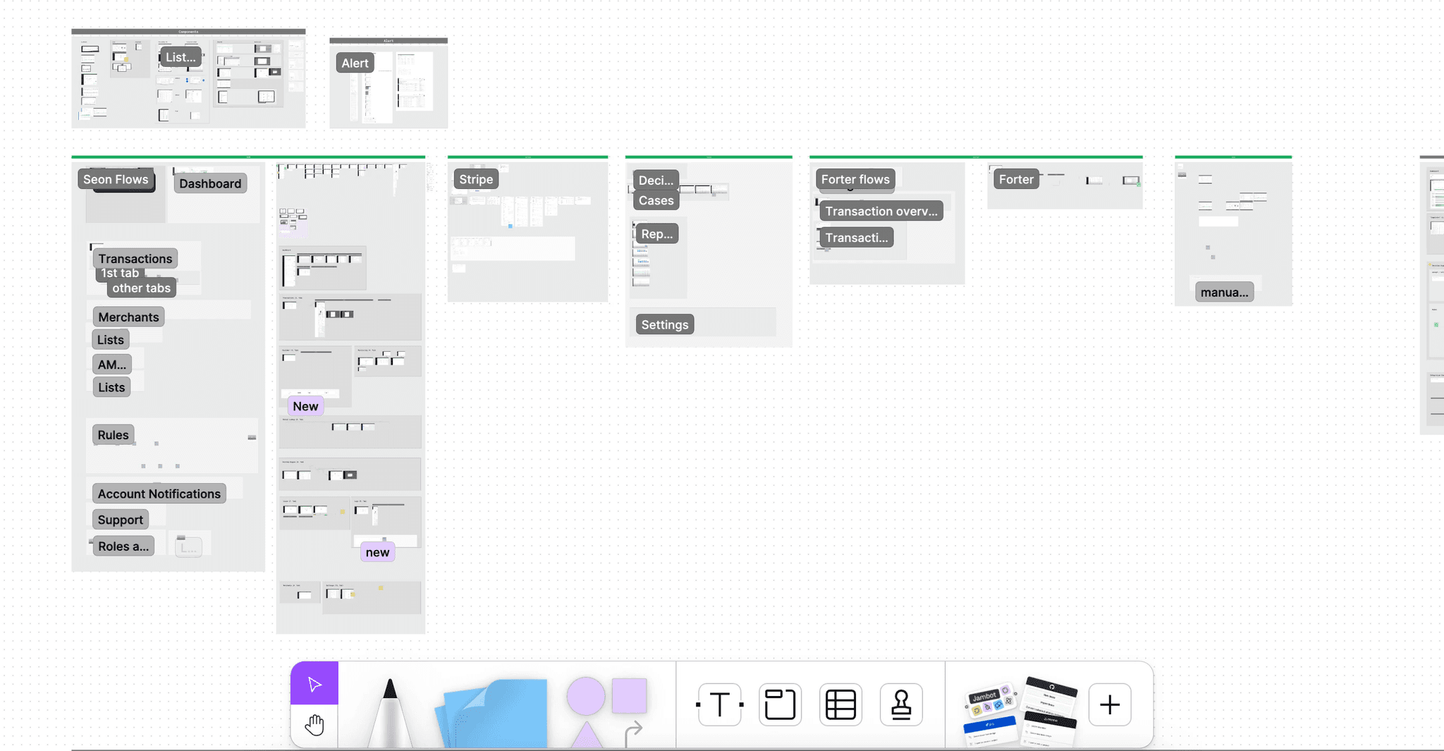
Need
Understanding the common patterns, industry best practices, primary competitors, UX & UI decisions.
Action
Comprehensive competitor analysis of flows, screens, features, patterns.
Result
A comprehensive report of competitors, capturing their strengths, weaknesses, user flows, interactions which later informed improvements areas.
Benchmark report
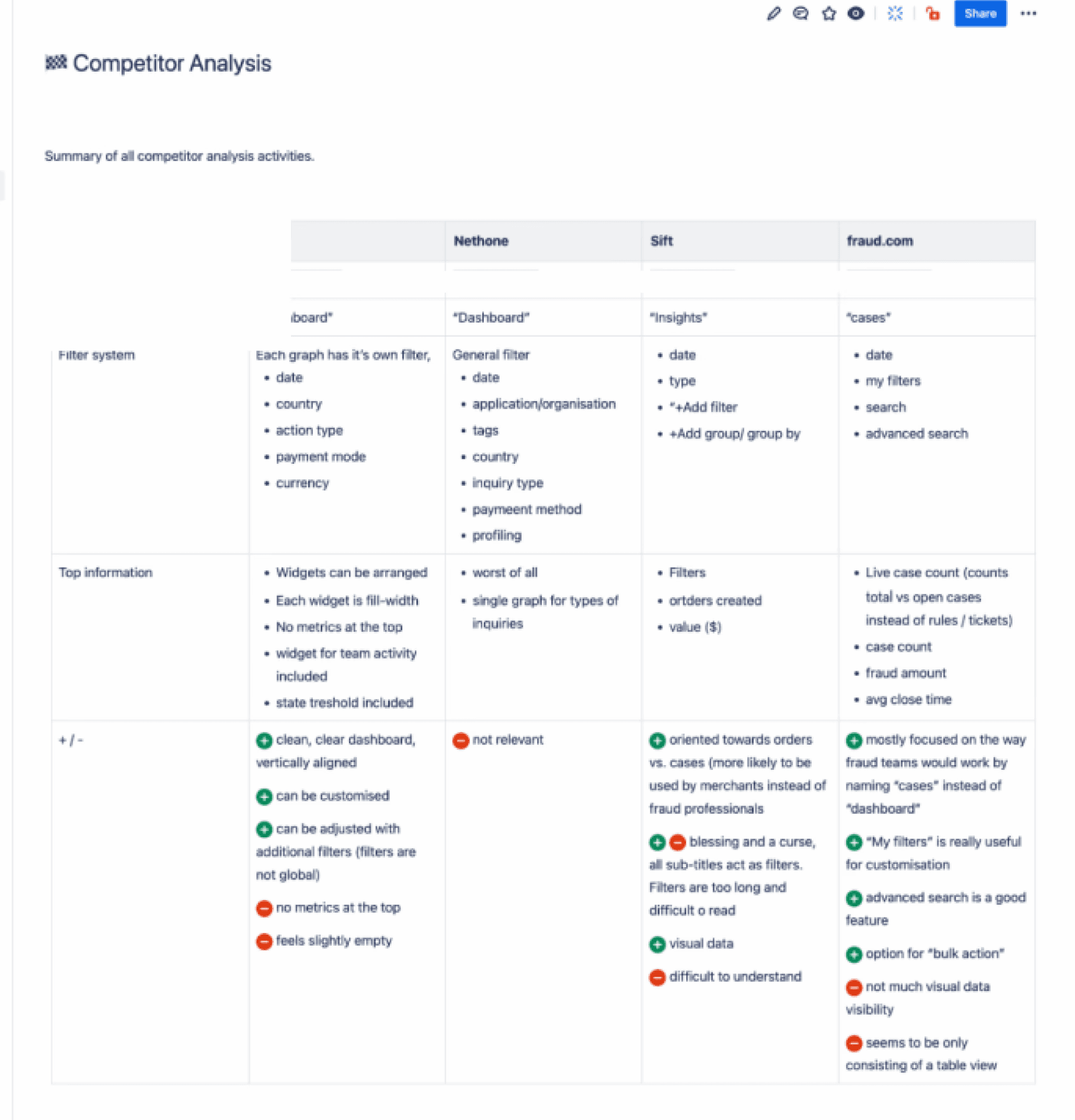
Need
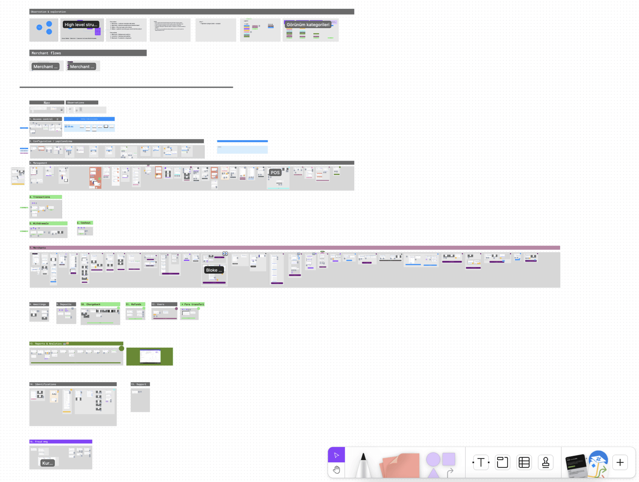
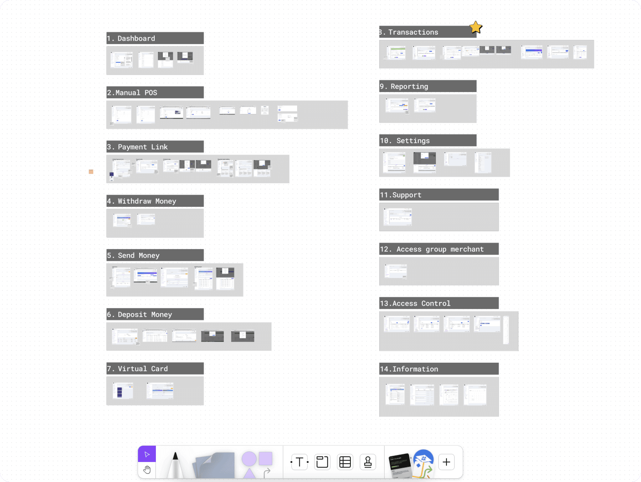
The board of benchmark flows was too big and too difficult to follow. I needed a clean, neat summary.
Action
Created a report summarising flows, assessing pros and cons, to summarise all of the findings.
Result
It saved us a lot of time and i was able to use this report as a reference point for certain decisions - going back and forth between pros and cons of every option i iterated.
Content audit
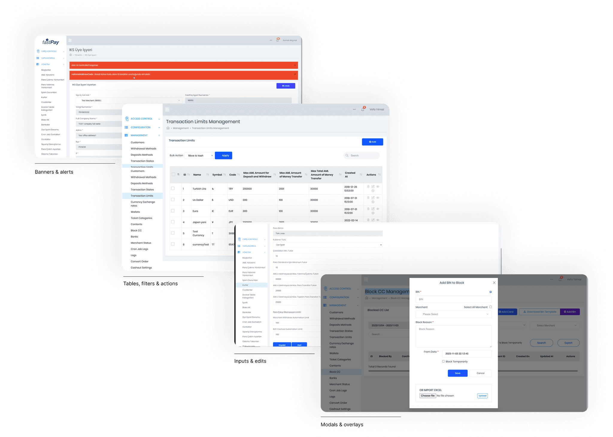
Need
The board of benchmark flows was too big and too difficult to follow. I needed a clean, neat summary.
Action
Created a report summarising flows, assessing pros and cons, to summarise all of the findings.
Result
It saved us a lot of time and i was able to use this report as a reference point for certain decisions - going back and forth between pros and cons of every option i iterated.
Deconstructing the existing platform
Problem
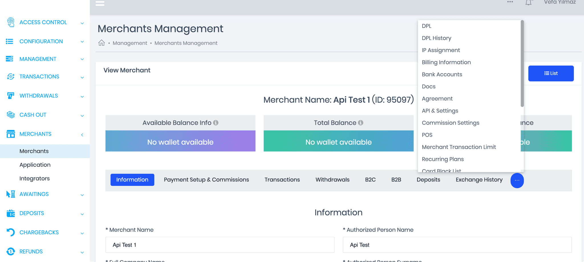
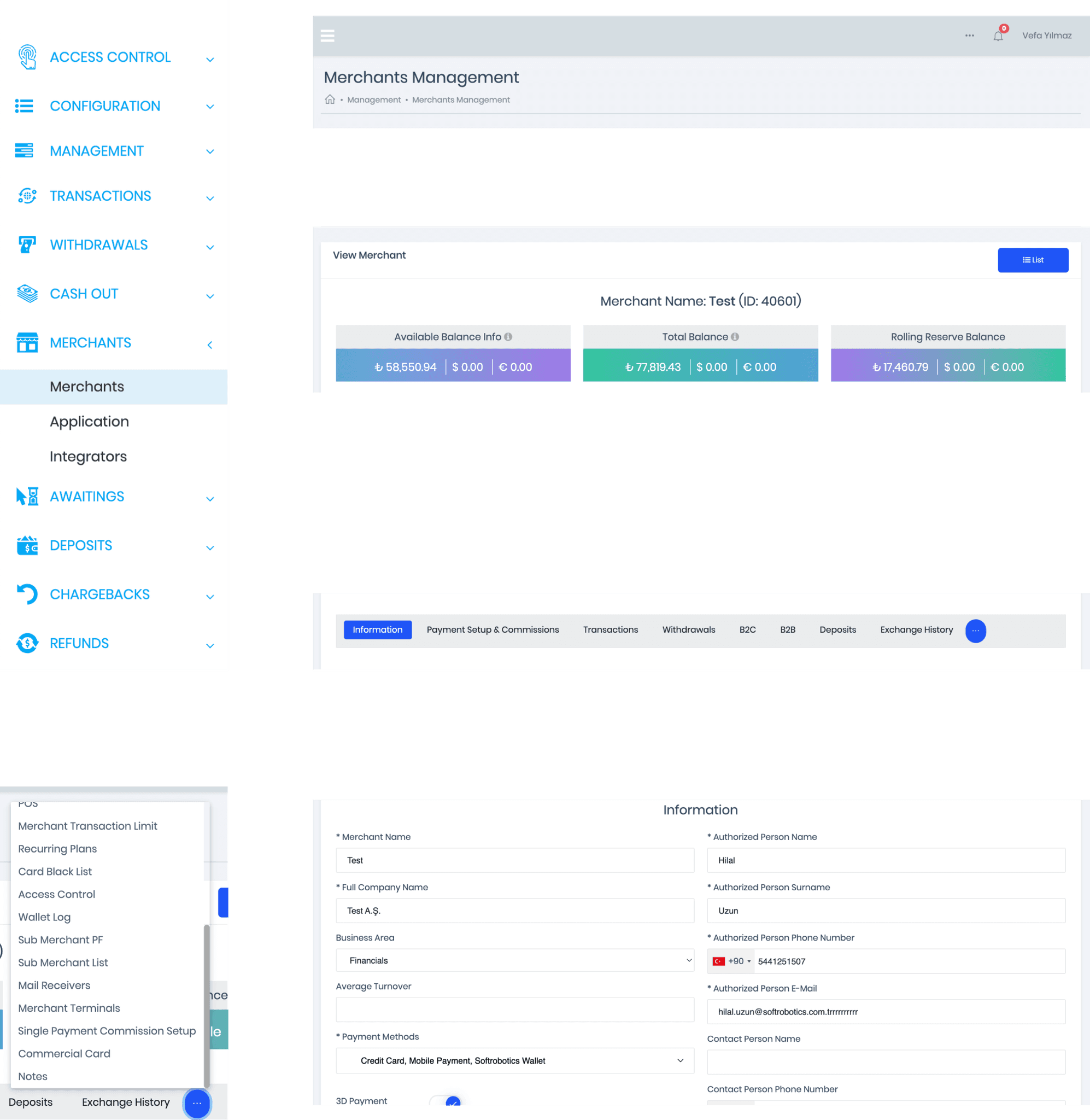
The main problem was the hierarchy of content and confusing information architecture.
Action
Deconstructed the most important screens (such as the merchant details screen)
Created an inventory list of must-haves for the most important screens.
Result
This exercise set the tone for the upcoming tasks and revealed that the entire platform could be streamlined into two interchangeable templates. I identified that only two templates were needed to support the primary user actions and the most common interactions:
- A summarized view for content categories (e.g., transactions, merchants, customers).
- A detailed view for individual content items within a category (e.g., a single transaction, merchant, or customer).
Rebuilding the IA
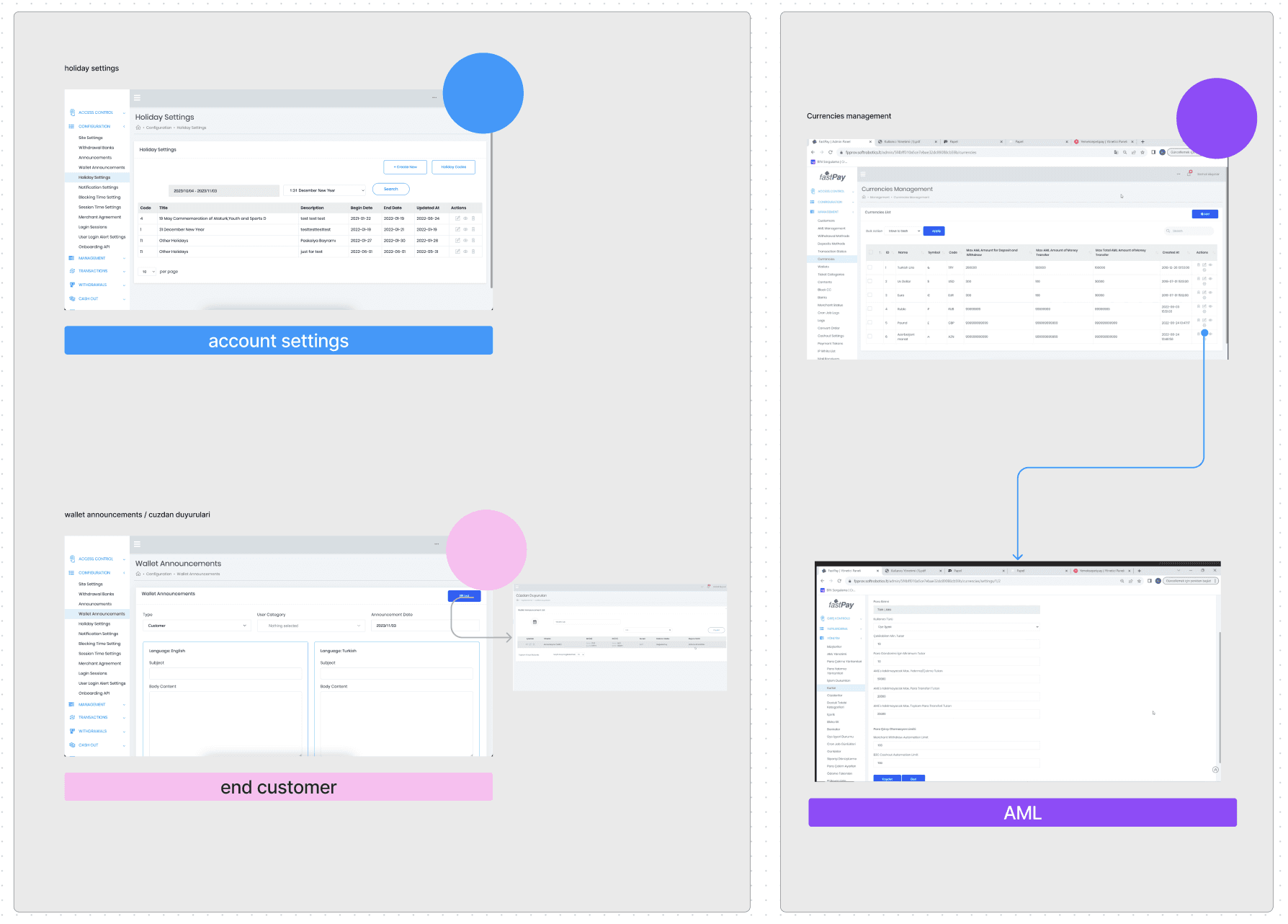
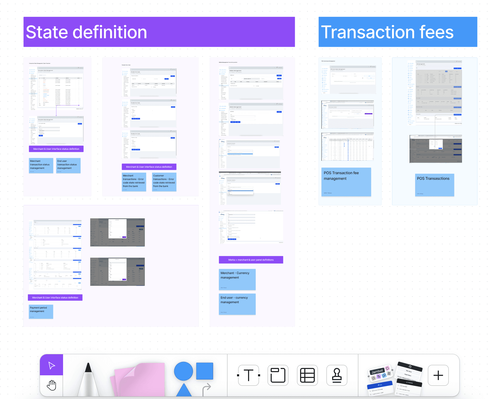
Problem
The main problem was the hierarchy of content and confusing information architecture.
Action
Deconstructed the most important screens (such as the merchant details screen)
Created an inventory list of must-haves for the most important screens.
Result
This exercise set the tone for the upcoming tasks and revealed that the entire platform could be streamlined into two interchangeable templates. I identified that only two templates were needed to support the primary user actions and the most common interactions:
- A summarized view for content categories (e.g., transactions, merchants, customers).
- A detailed view for individual content items within a category (e.g., a single transaction, merchant, or customer).
User testing / card sorting
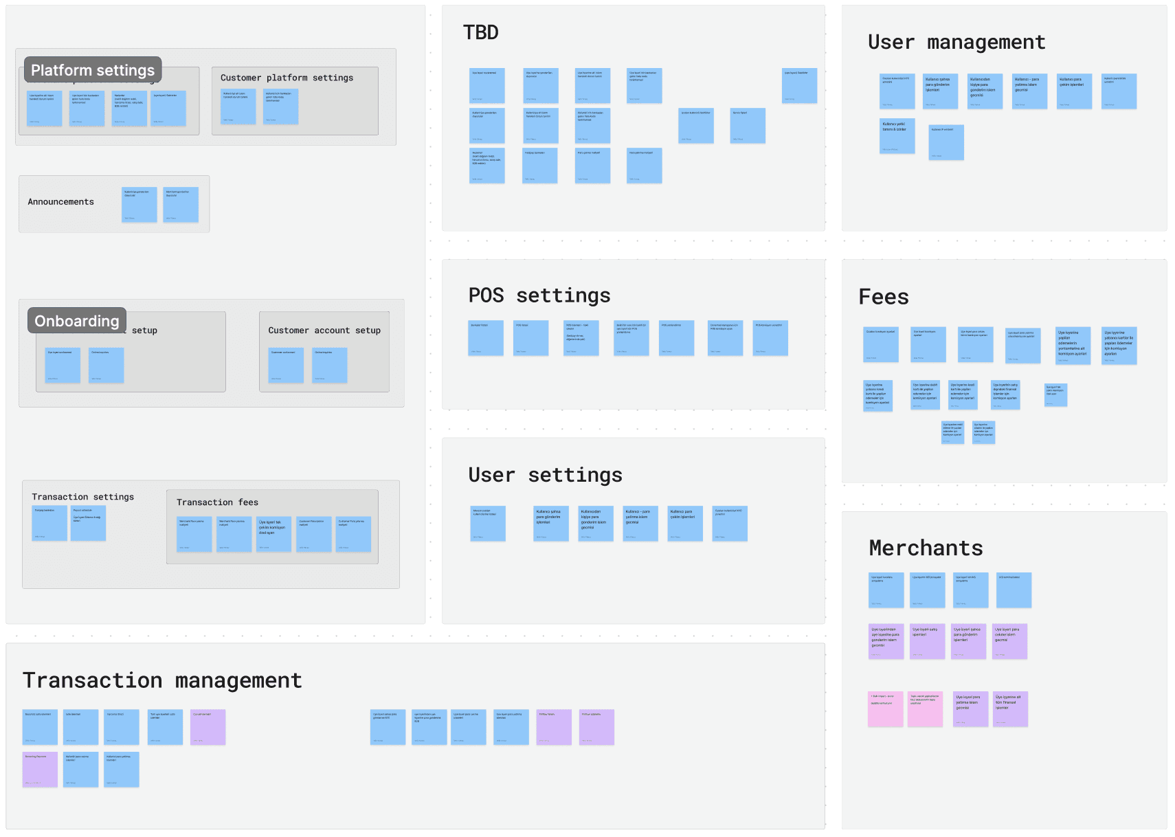
Problem
Having compiled descriptions for the colour-grouped screens, i had to find a way to asses the effectiveness and intuitiveness of the groupings.
Action
Facilitated card sorting sessions with the internal team to assess how well the groupings align with their mental models.
Result
Identified Common Themes and discrepancies in groupings.
Improved Labeling
Gathered insights for navigation improvements.
The IA
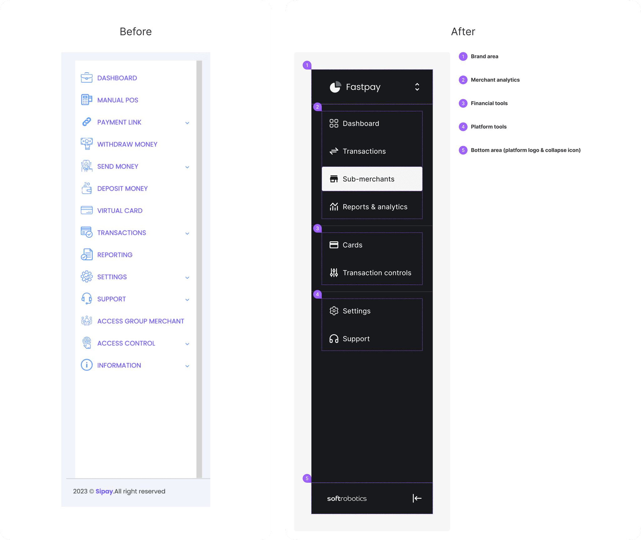
Problem
The existing navigation
- Grouped all content categories in a single location,
- lacked a clear structure,
- Did not adhere to a proper UX structure.
Action
Organized menu items based on relevance, user profiles, and insights from card sorting results.
Result
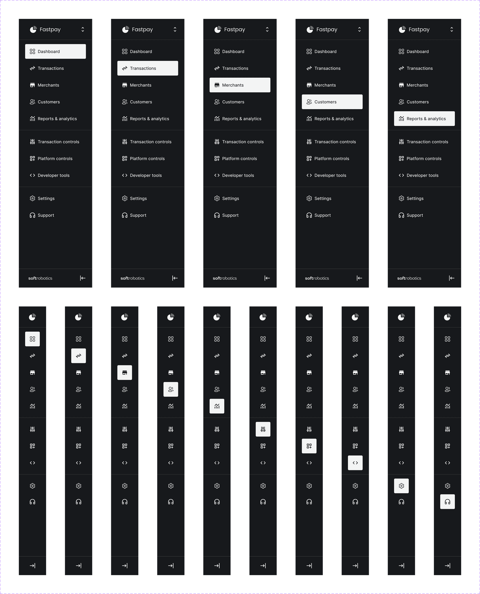
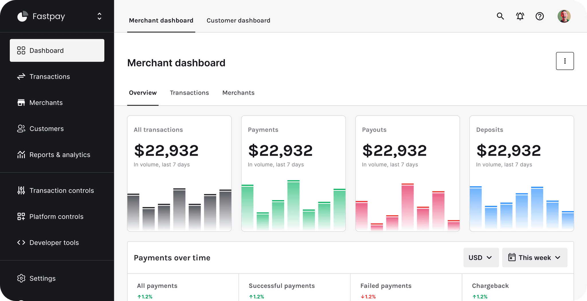
Enhanced content discovery: By dividing the left panel into three sections, I developed a scalable solution. The top section is visible to all users, the second section is designated for administrative accounts, and the final section is reserved for platform-related actions, which is aimed to reduce the cognitive load.
UX Anatomy
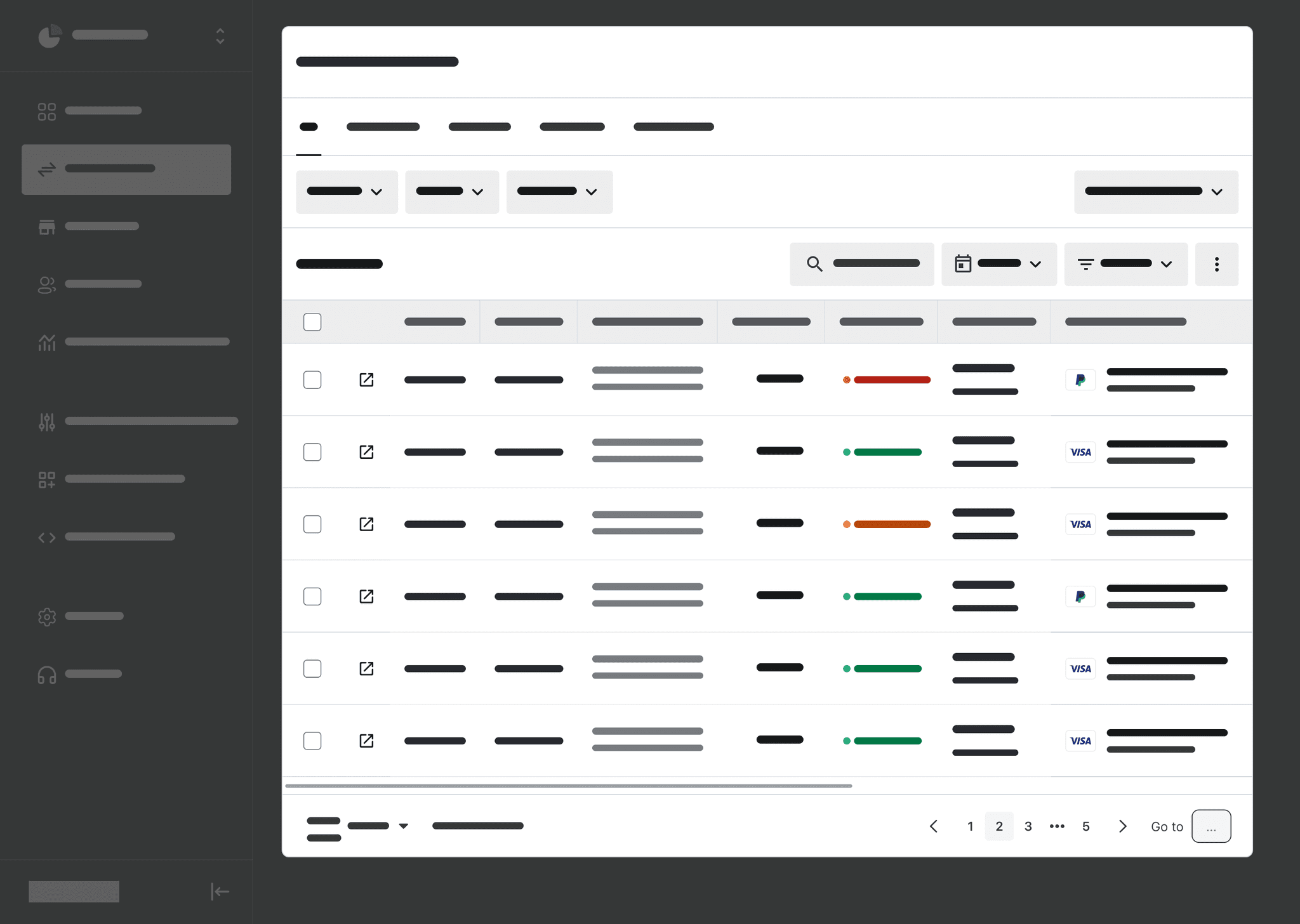
Table view
Preview
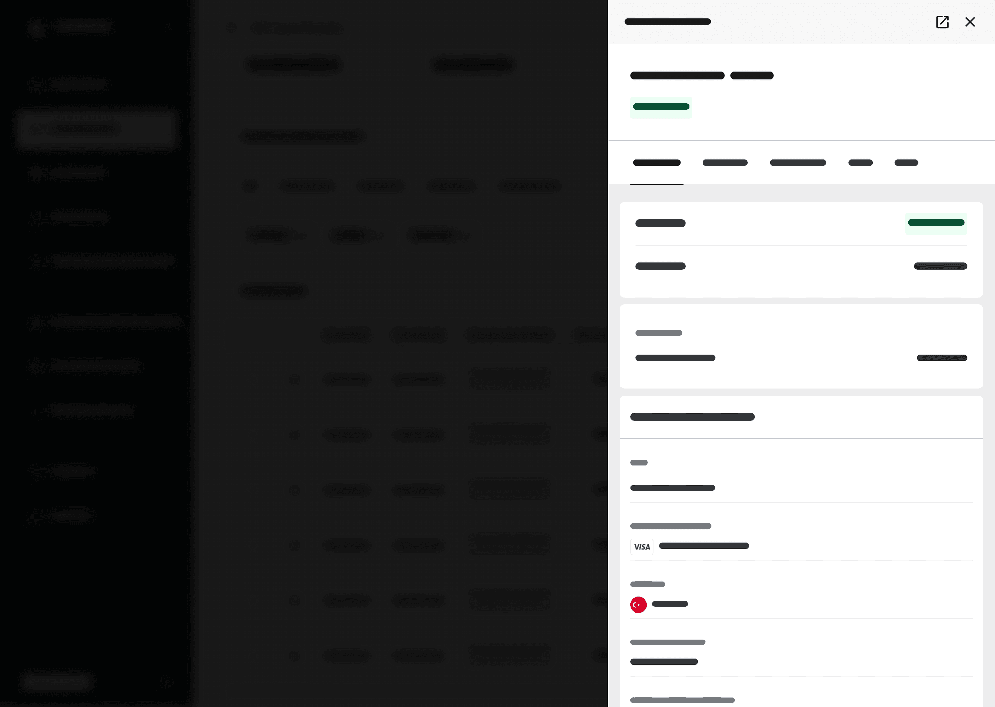
Detail view
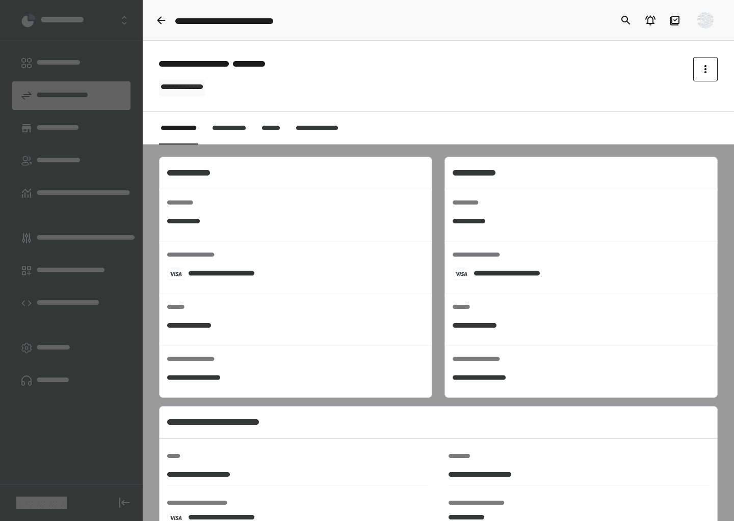
In terms of UX, these 3 screens cover %80 of the platform requirements. As previously mentioned, the need was to have
- A summarized view for content categories (e.g., transactions, merchants, customers).
- A detailed view for individual content items within a category (e.g., a single transaction, merchant, or customer).
Anatomy in action
The look & feel
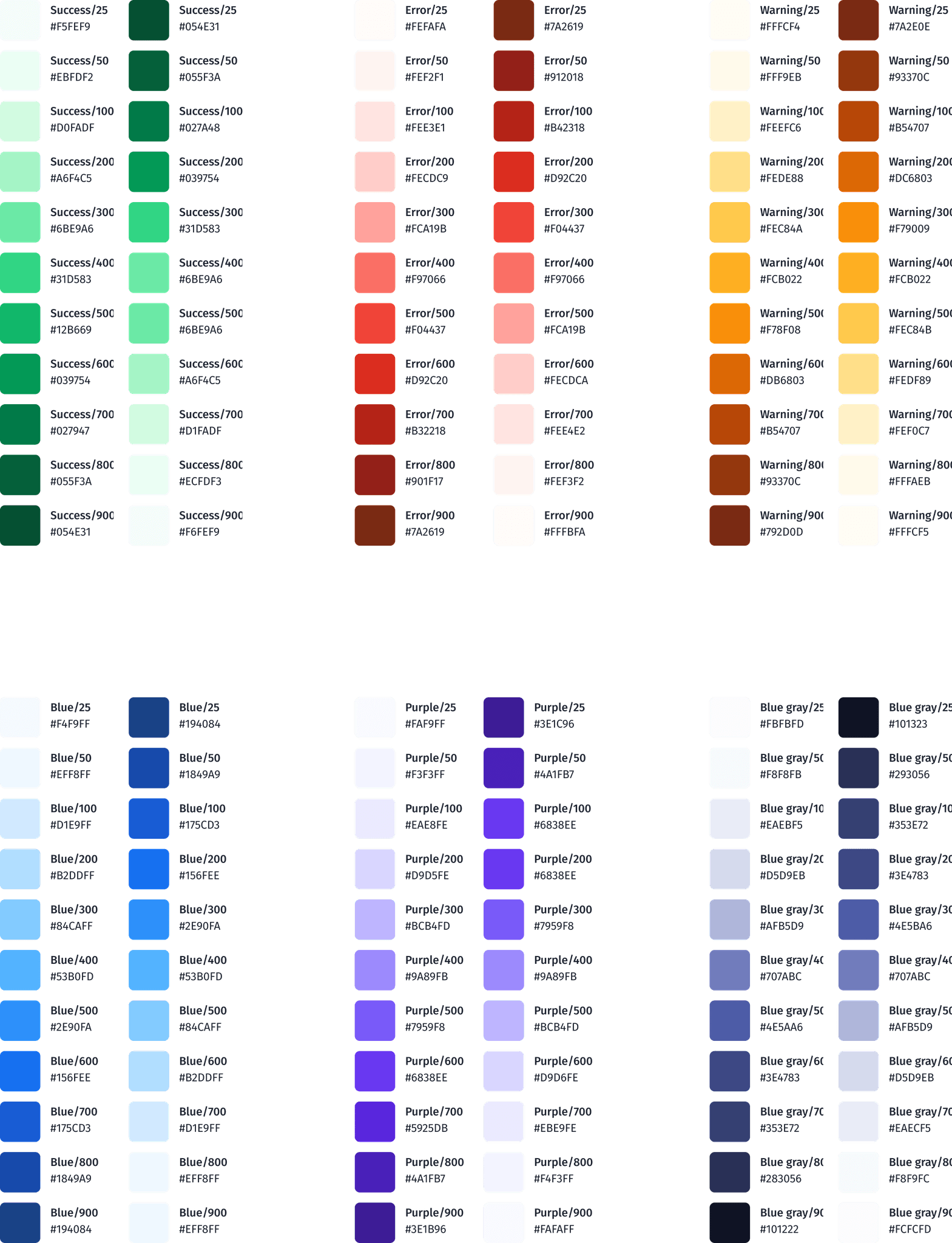
Colours
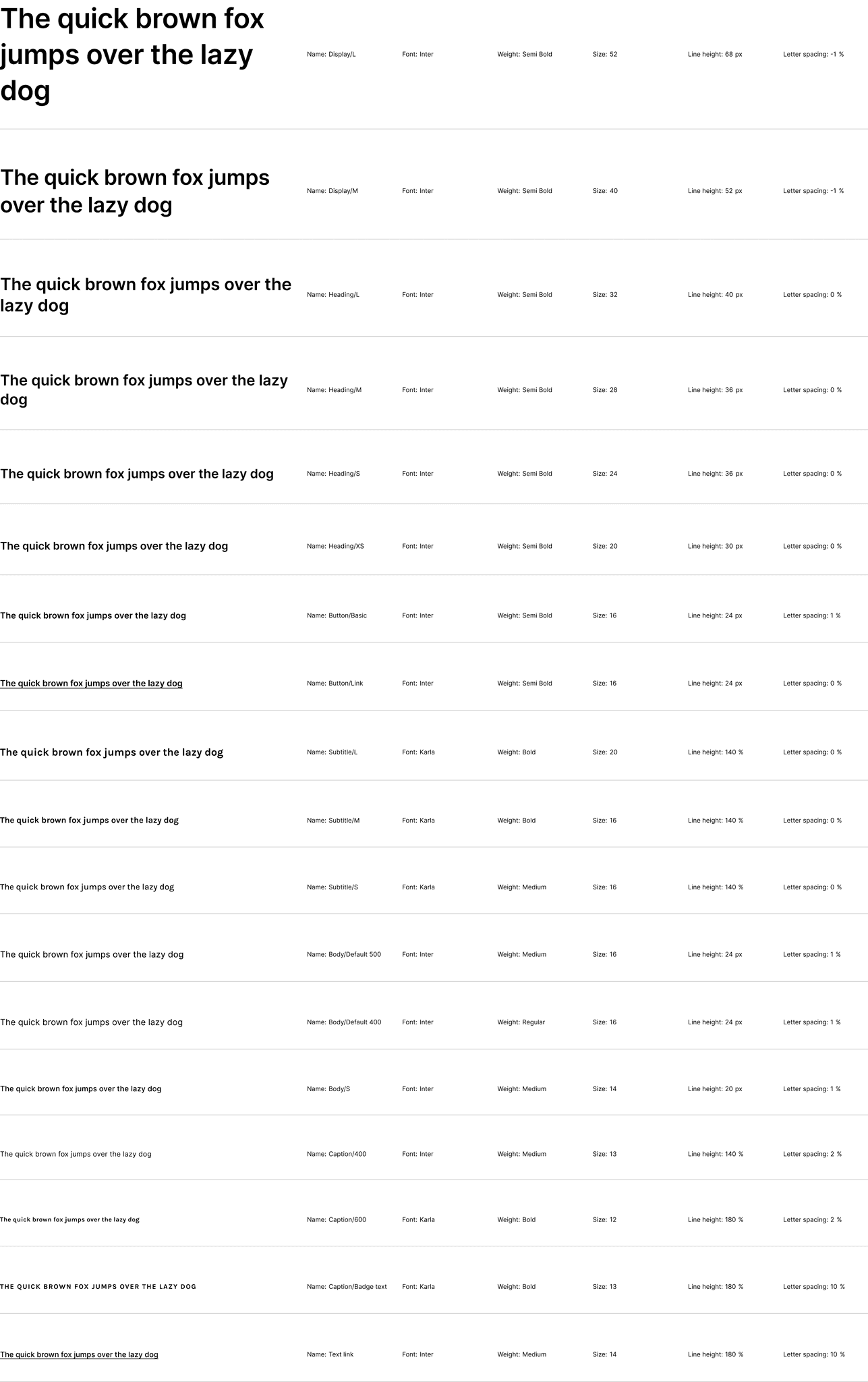
Typography
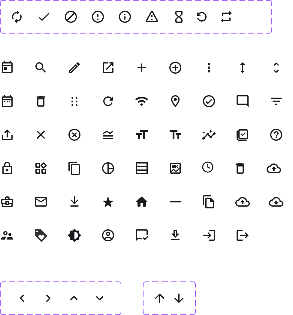
Iconography
Navigation components