Elevating User Interaction for headphones
Redesign of the Music app’s primary interfaces—the homepage, headphone controls, and navigation tab bar. Focused on creating an intuitive and streamlined user experience, the redesign aimed to improve ease of use and consistency across key touchpoints.

Overview
When I joined in 2022, the Px7 S2, part of the new Px series, was released shortly after, featuring a fresh headphone UI. In 2023, I led a comprehensive redesign of the Music app’s main controls and UI elements, enhancing both UX and UI by introducing scalable components and streamlining navigation. This redesign boosted user satisfaction and engagement, aligning seamlessly with business objectives and supporting development goals for a more adaptable and intuitive experience.
Start here
Homepage in 2022
Show audit notes

Task analysis
Multipoint component

Bottom tab

Card elements and hierarchy

1st task
Multipoint: framing the problem
Existing component
Analytics & User insight
Stakeholder alignment
UX & UI issues
The component displayed various connection states, making it challenging to comprehend their meanings.
Too many states
Unclear/varying state definitions for connected/not connected scenarios
Too many visual elements (dashed strokes, fills, low-transparency fills)
Too many interactions (tapping once would connect, tapping again wouldn't do anything. Tapping & holding would lead to a list of connections)
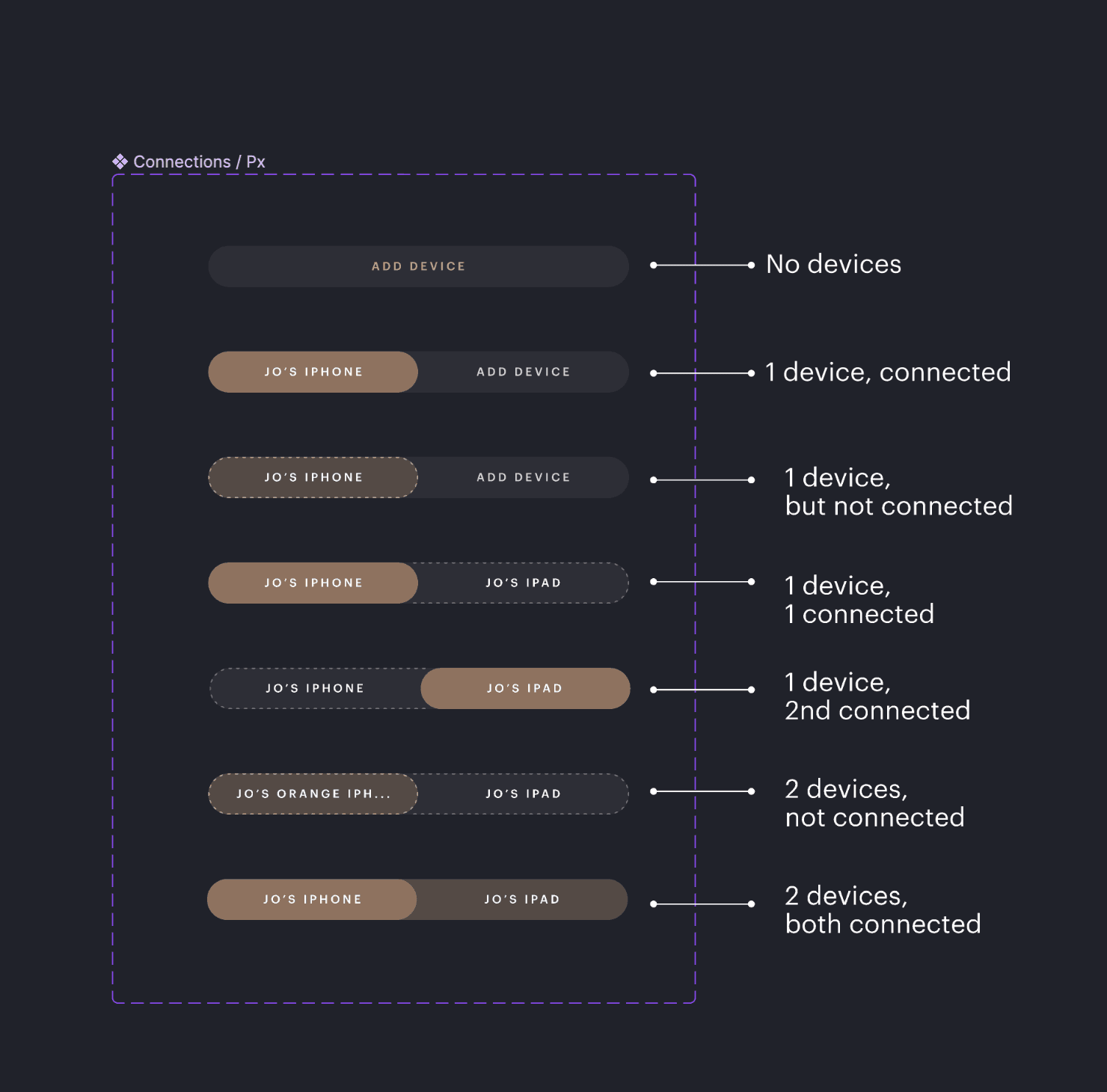
Some states were illustrated with
"dashed strokes" which made it more confusing
Multipoint: the redesign
Multipoint in action
Ideation 1
Ideation 2
Refinement
Tapping the lozenge triggered an 'interim' state, causing the selected section to blink.

Multipoint: testing

Tapping the lozenge triggered an 'interim' state, causing the selected section to blink.
Multipoint: before / after
Results
%25 increase in feature engagement from April 2024 to September 2024 (the launch date of Pi6 and Pi8, when we first introduced this feature)
Navigation tab
Before / after

From left to right, "Browse" (or home), Library, Search, and Settings.
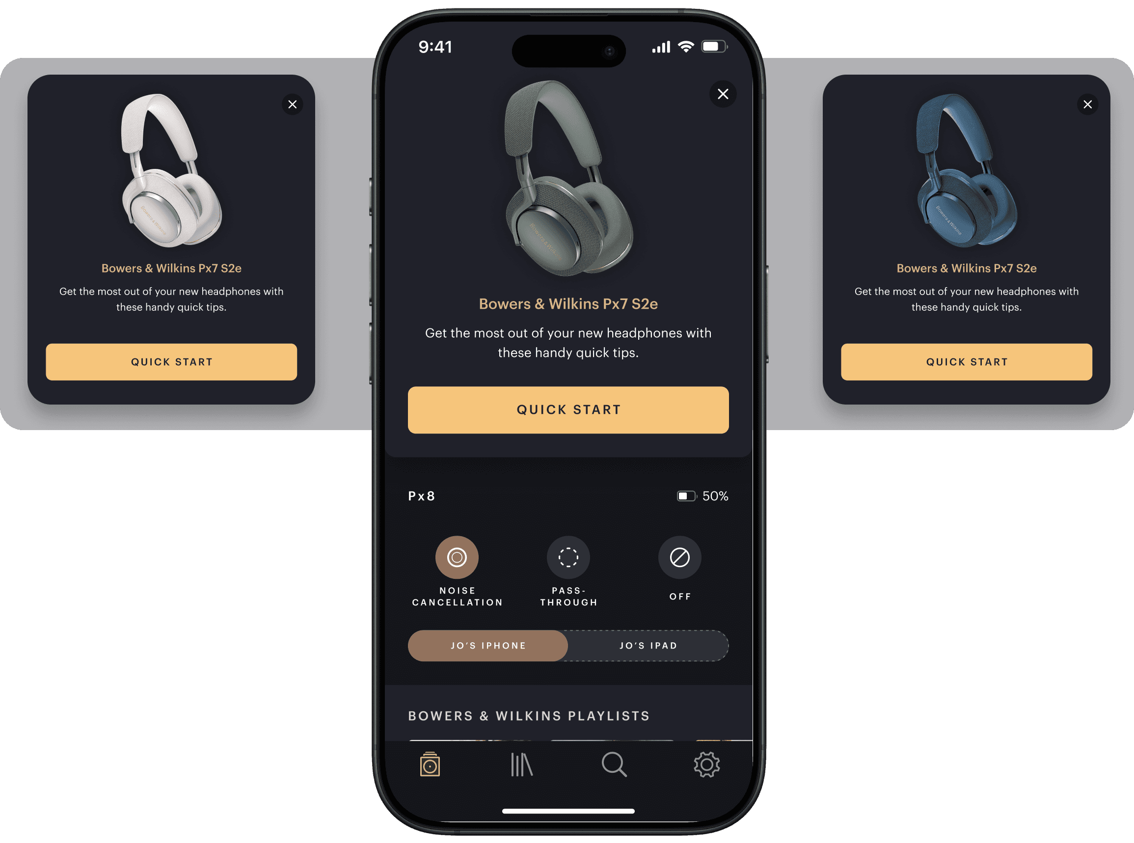
Headphone controls
Before (left) vs. After (right)


Improvements
(Please scroll on both screens above to see below the fold)
Placing controls directly on the main page led to user confusion and a cluttered appearance. Therefore, only the main controls were prioritised and displayed. From analytics data it was observed that ANC setting is the most interacted setting on this page.
The lack of clear separation between sections made it hard for users to understand control groupings.
This was solved by adding "dividers"
Inconsistent text styles, mixed icon usage, and variations in capitalisation (uppercase in some titles, lowercase in others) further disrupted the visual coherence and usability.
This was resolved by establishing consistency across menu items and incorporating icons for each row.