The "Multipoint"
We call it to define multiple device connections established with a single Bowers & Wilkins headphone.
Problem
Based on the app analytics, this feature was not commonly used (around 13.6k users out of total active monthly users) yet it is one of the important features that's not offered by many competitors.
Value
It is one of the important features that's not offered by many competitors, which allows bluetooth connection management directly from the app, without leaving it.
Need
Existing component didn't accommodate the edge cases and
Solution
New UX & UI solution for connection management that is scalable, understandable, and easy to use.
UX issues
The component displayed various connection states, making it challenging to comprehend their meanings.
UI issues
It was difficult to utilise the toggle (or lozenge) component to accommodate longer device names. The biggest issue was that when 2 devices are connected, it almost seemed as if only one of them is active and the other has to be tapped to be activated, which wasn't accurate.
Discovery
There were multiple places in the app that would be affected by potential changes. creating journey maps and defining our objectives was the first step.
Alignment
After defining all touch-points that needed change, we came together to decide on the priority of these touch-points as it was then translated into tasks and sub-tasks.
analytics
Total amount of users before the redesign.
76.2k
iOS
42.2k
Android

Some states were illustrated with "dashed strokes" that made it difficult to understand.

In reality, both devices can become active. When one of the devices start playback, bluetooth connection is automatically switched.

I created journey maps and competitor benchmark.

Stakeholder alignment meeting board
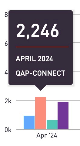
Amount of users interacted with the connection component in settings.
Ideation
First ideation
Existing QAP wasn't understandable
Increasing the space for the action buttons could be solution

Trying out new layouts / components
Second Ideation
Previous solution took too much space on the homepage
We wanted to prioritise content over connection management
Needed smaller components that clearly communicate
Connected
Not connected
Establishing connection

Trying out new layouts / components
Refinement
Using badge-like components had multiple opportunities:
clear connection state
flexibility and scalability (very long device names are no longer an issue)
additional button for "more devices" to see the entire list.

Wrapping up the final design
Testing
User testing results showed that the design was intuitive and easy to understand for first-time users.

Sneak peak from one of the unmoderated user tests
Before / after
Previous terminology like "connections" caused confusion about its meaning—whether it referred to a headphone-to-device connection or device-to-device pairing.
User testing revealed that renaming it to "paired devices" provided better clarity, as it clearly indicated "all devices paired to headphones.
Before users had scroll to access "connections", now it's positioned above the fold.
Finalising
Users completed tasks within seconds, providing the confidence to move forward with the final review. After designing screens for each use case, I integrated components into the design library and prepared them for hand-off.

Final states
Results
%25 increase in feature engagement from April 2024 to September 2024 (the launch date of Pi6 and Pi8, when we first introduced this feature)
Before / after
Next Projects
View other projects and case studies.